149 selected stores
eCommerce collection page design examples
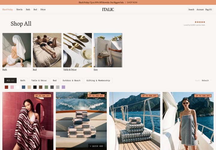
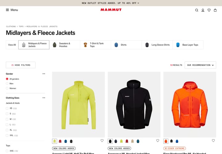
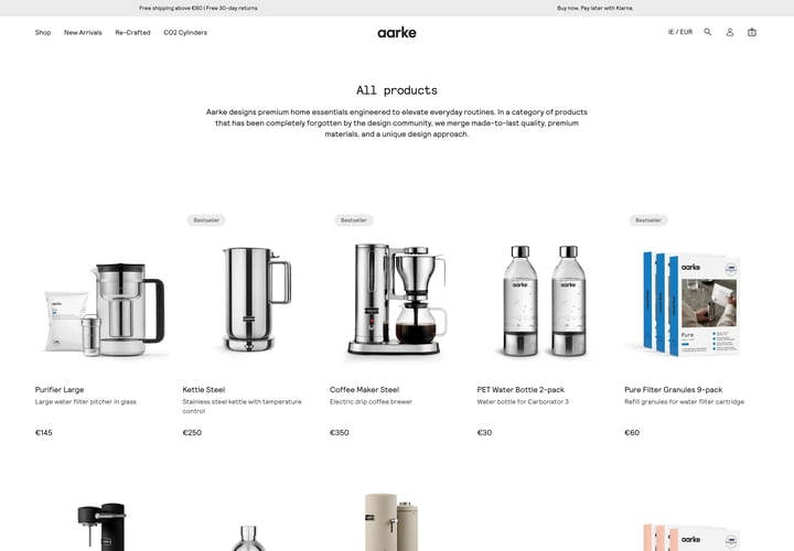
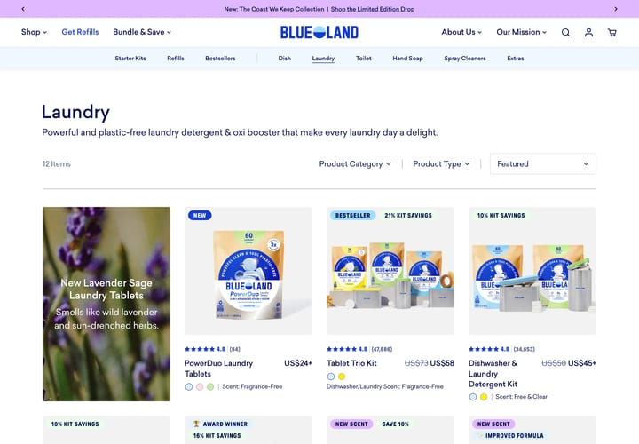
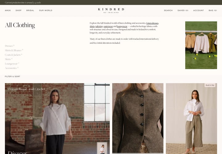
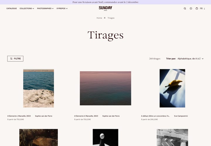
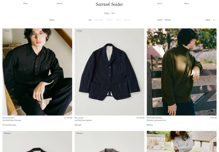
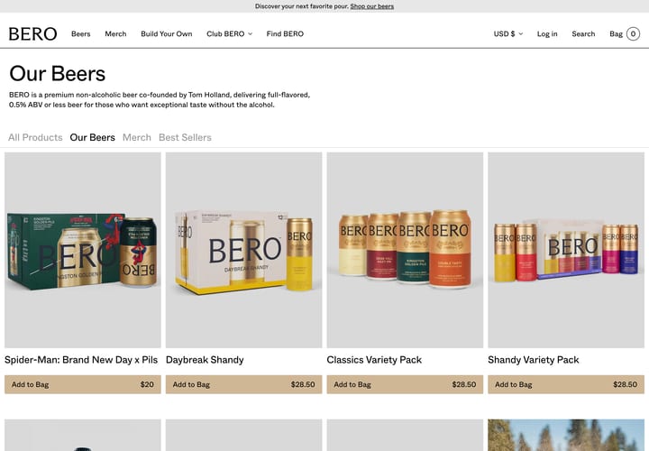
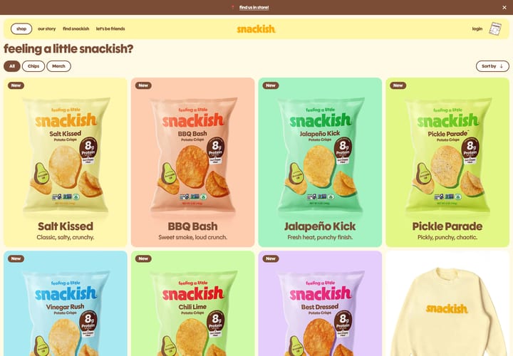
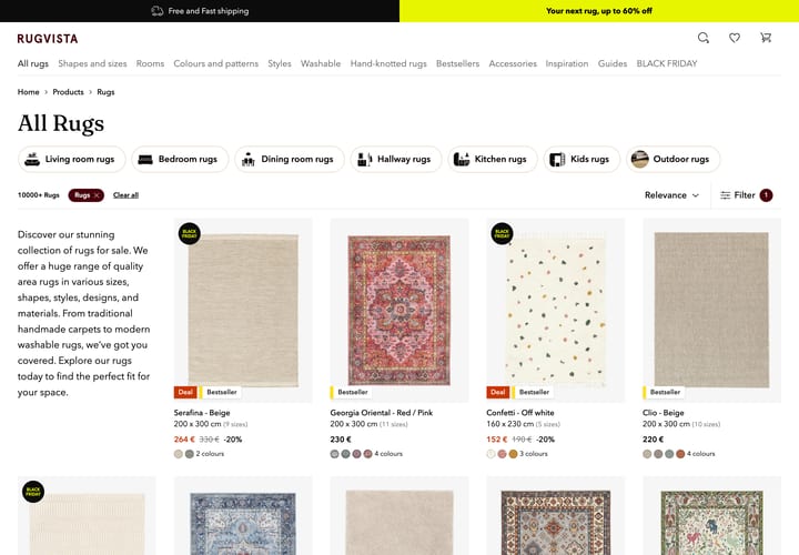
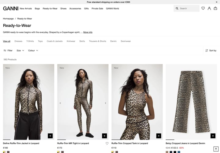
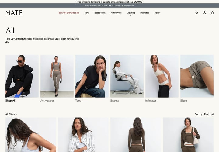
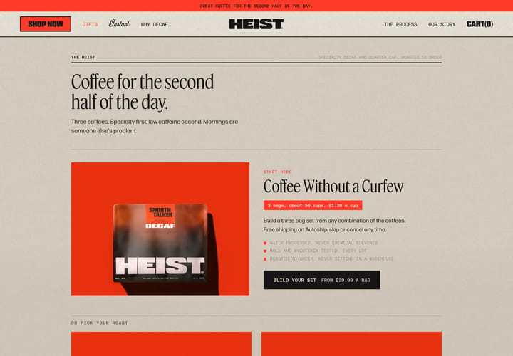
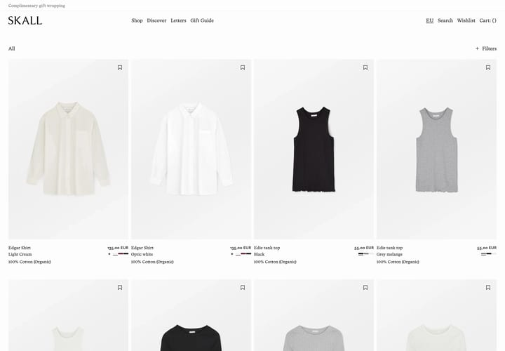
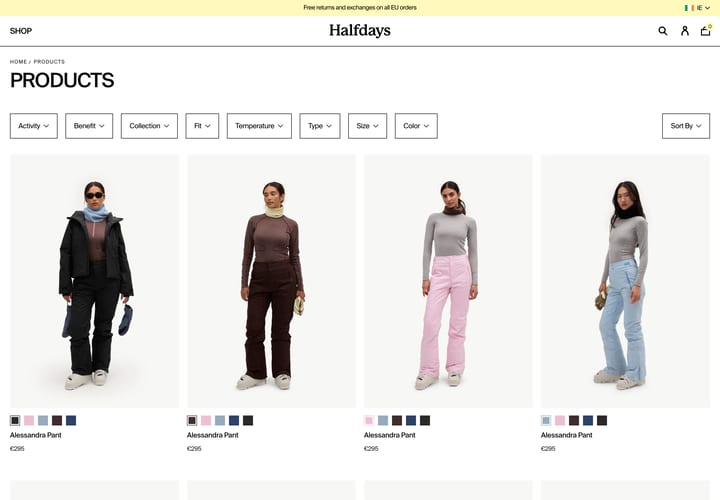
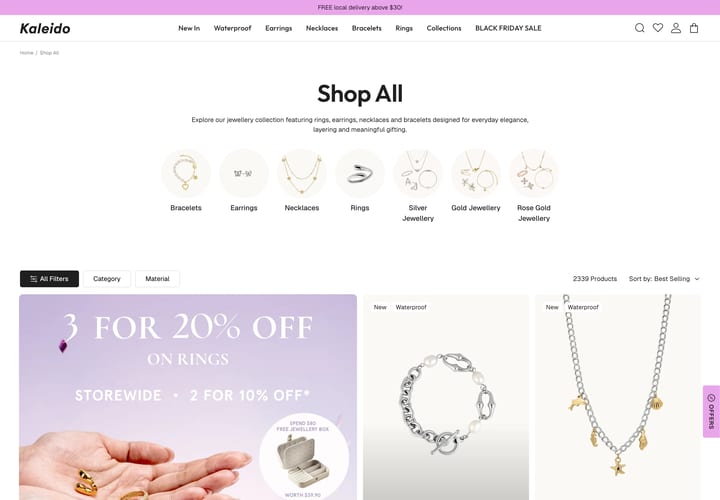
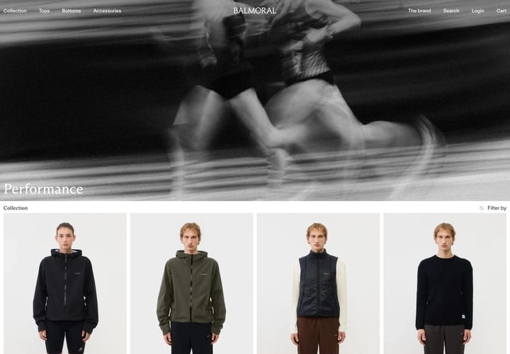
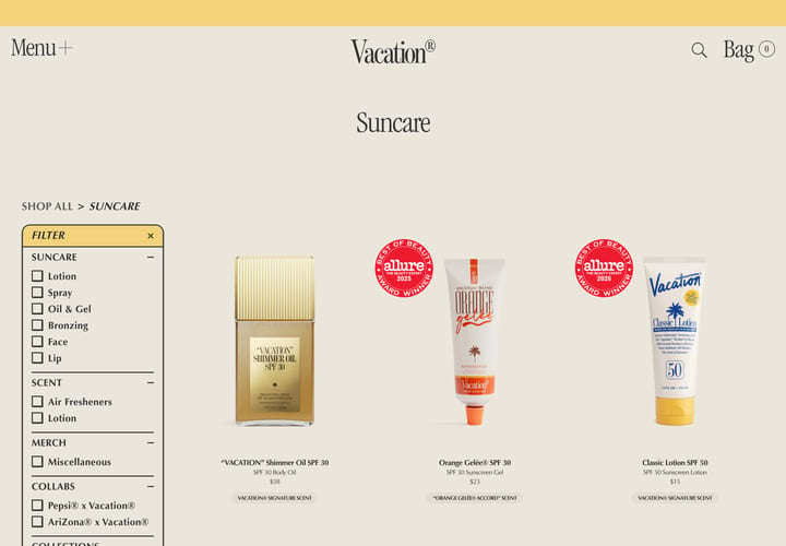
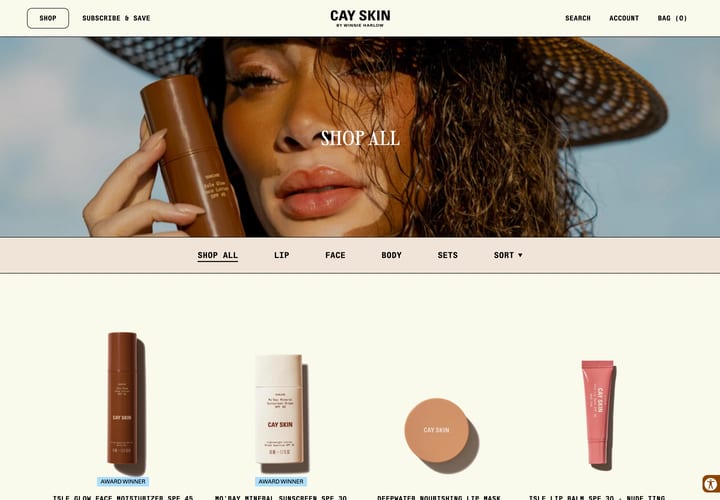
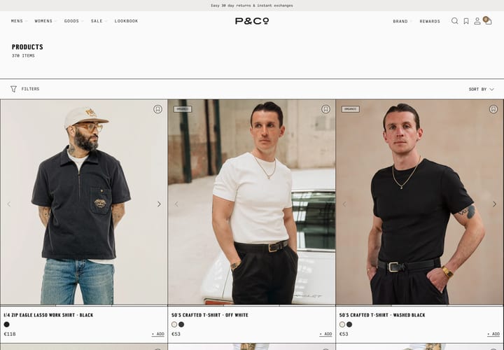
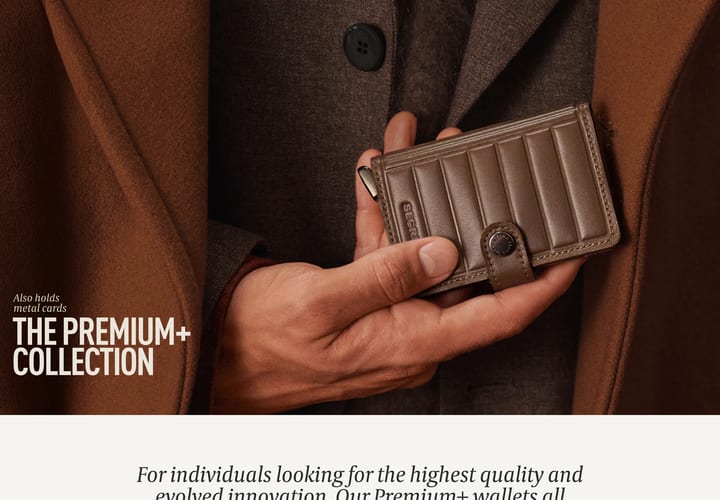
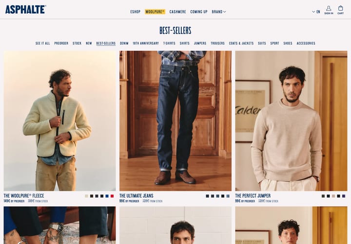
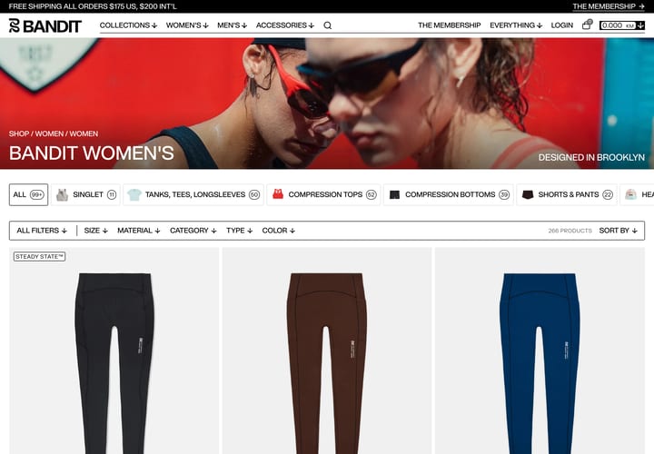
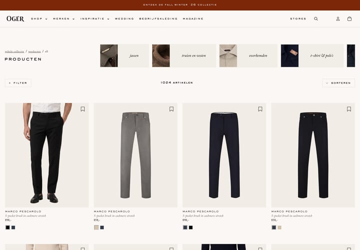
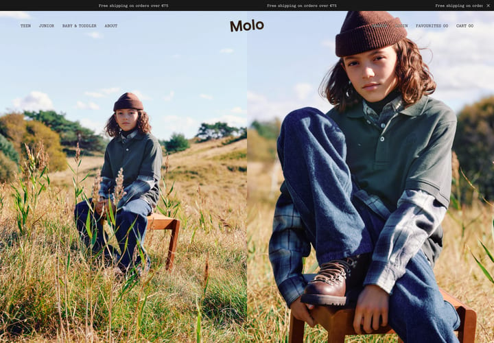
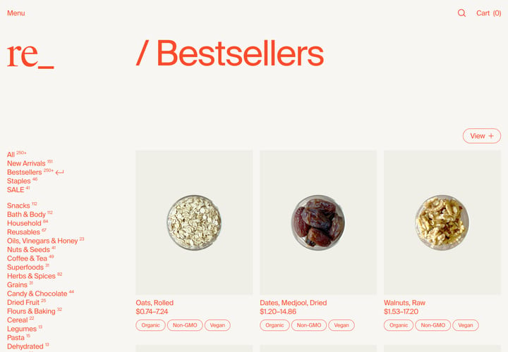
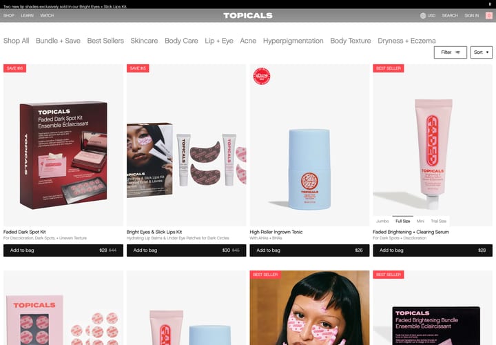
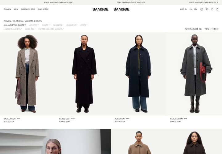
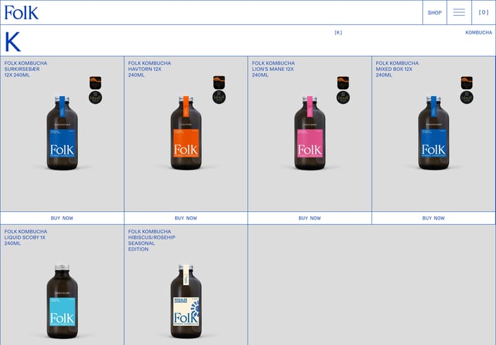
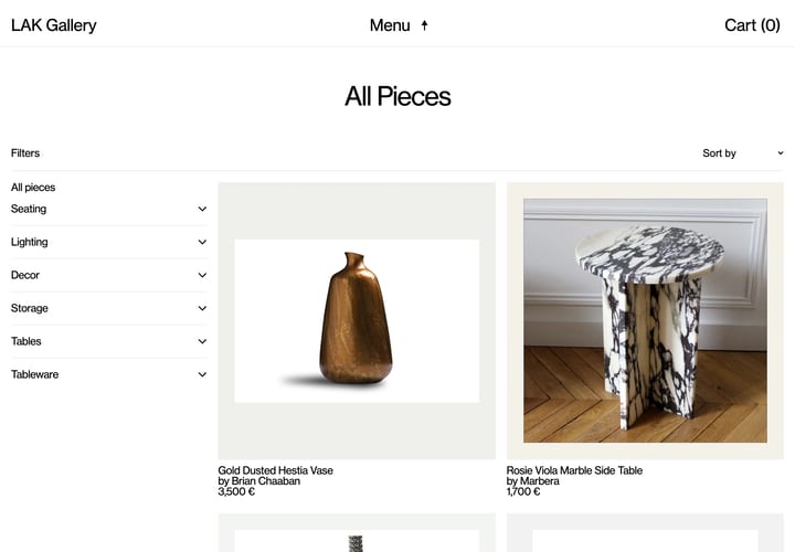
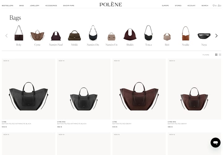
Category and collection pages from our selected stores. See how they handle product grids, filtering, sorting and the space around the products.

What to look for in a collection page
This is where most people decide what to open, so small things add up. A grid that's easy to scan makes that decision quicker.
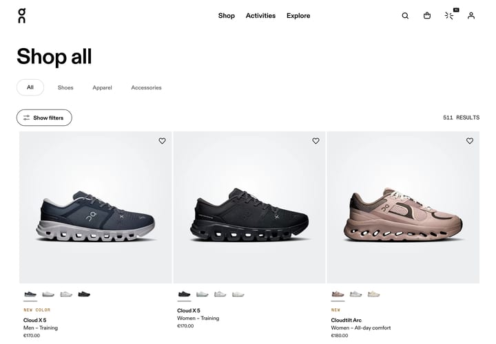
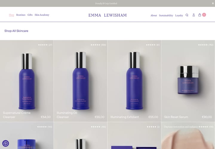
- Grid density. Two, three or four across? Denser grids show more, but each tile has less room for the name, price and colour options.
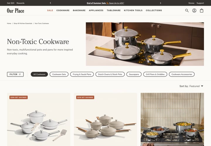
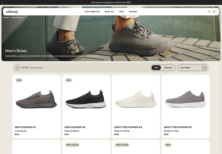
- Filtering and sorting. A sidebar, a drawer or a top bar. Smaller catalogues often skip filters altogether, and that's usually the right call.
- Product tiles. Hover images, swatches, quick add, badges, review stars. Few stores use all of them, so notice which ones they kept.
- Context at the top. A line of intro copy or a row of sub-category links can help. Plenty of stores skip both and go straight to the products.