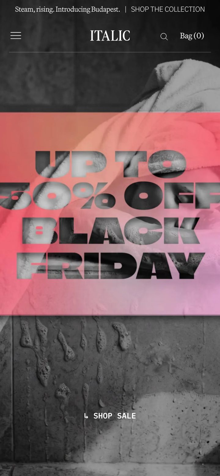
161 selected stores
Mobile eCommerce website design examples
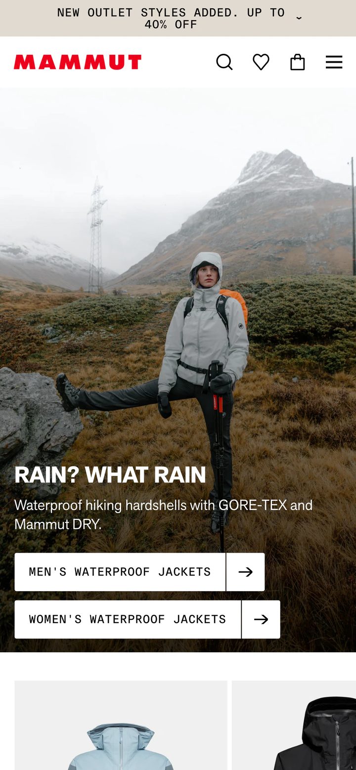
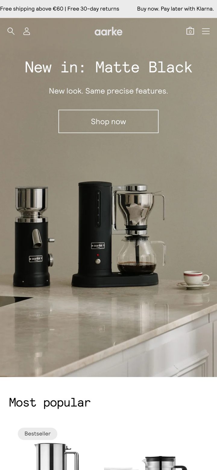
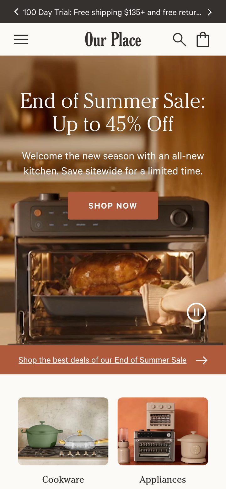
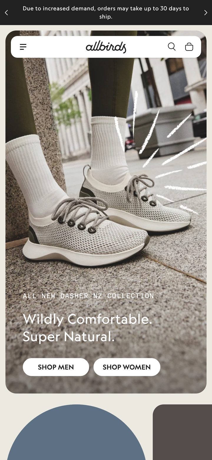
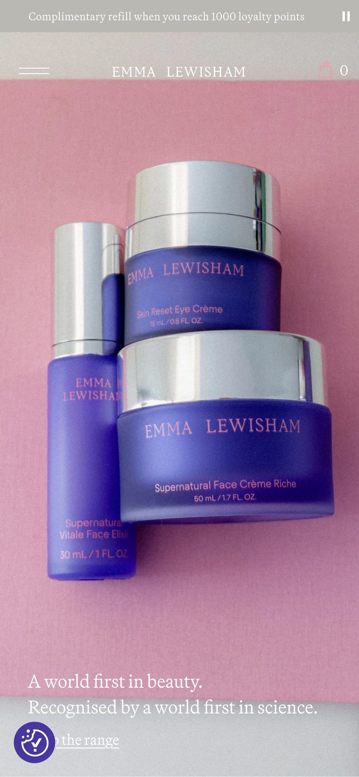
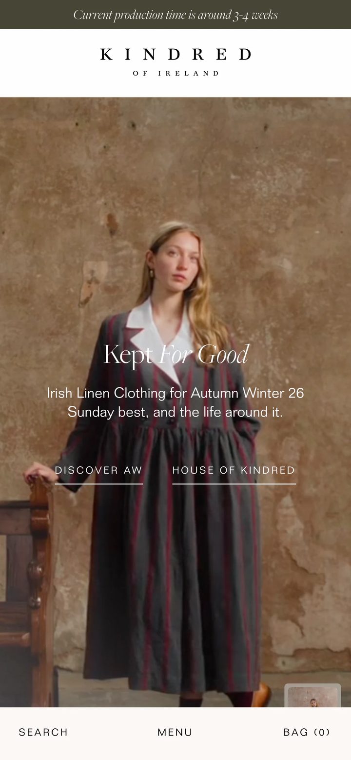
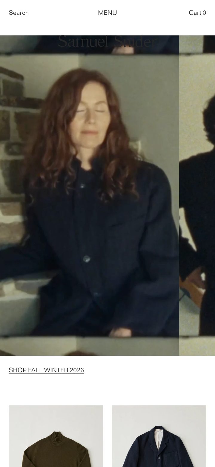
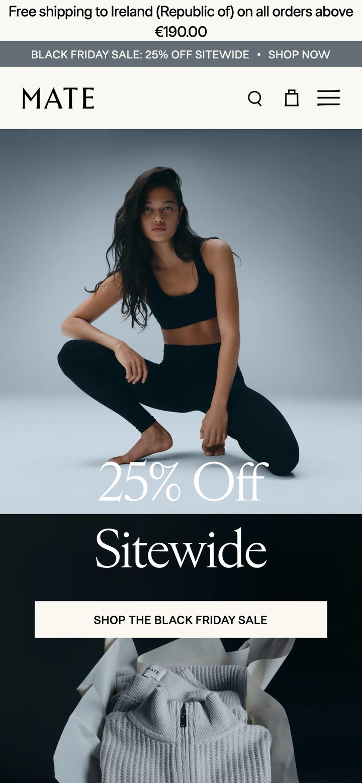
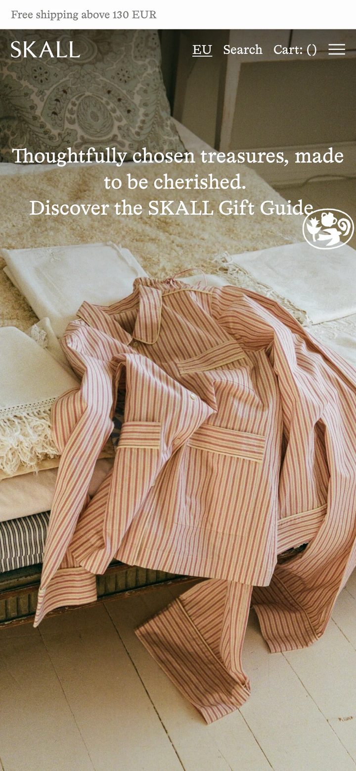
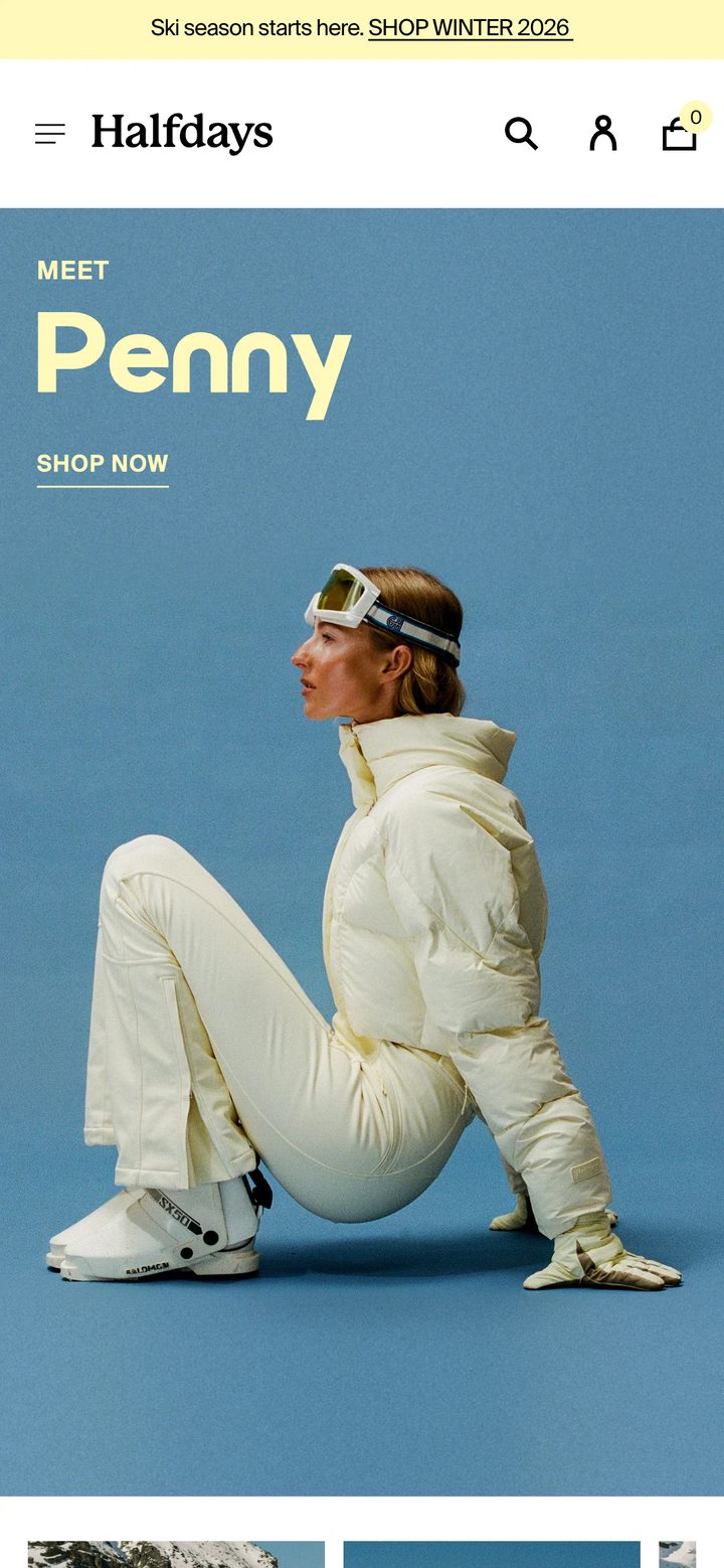
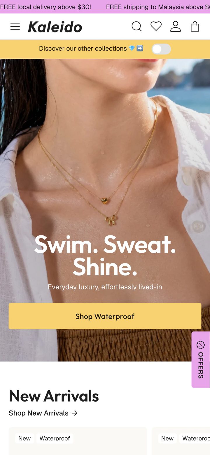
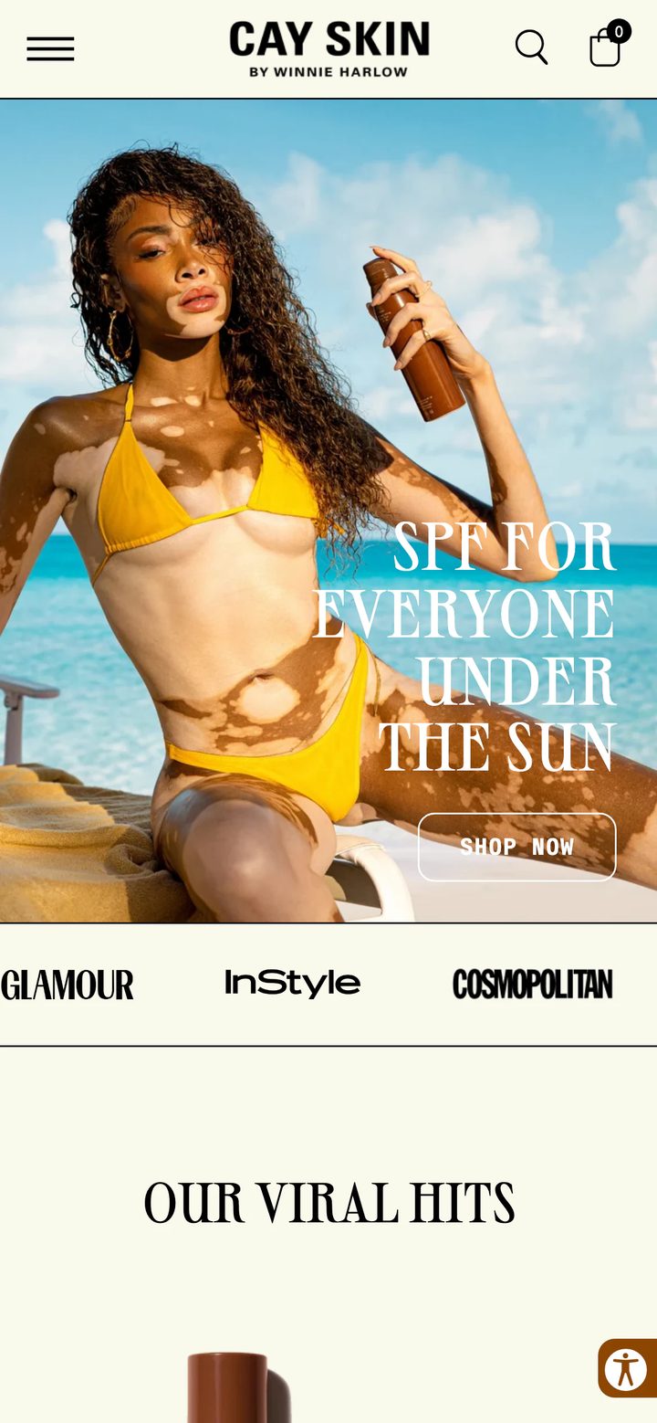
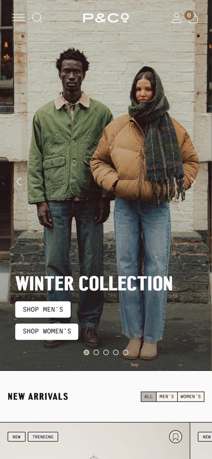
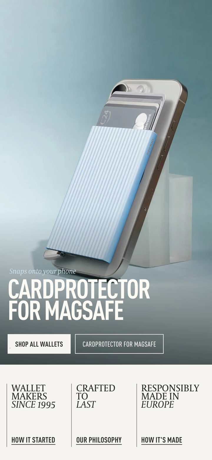
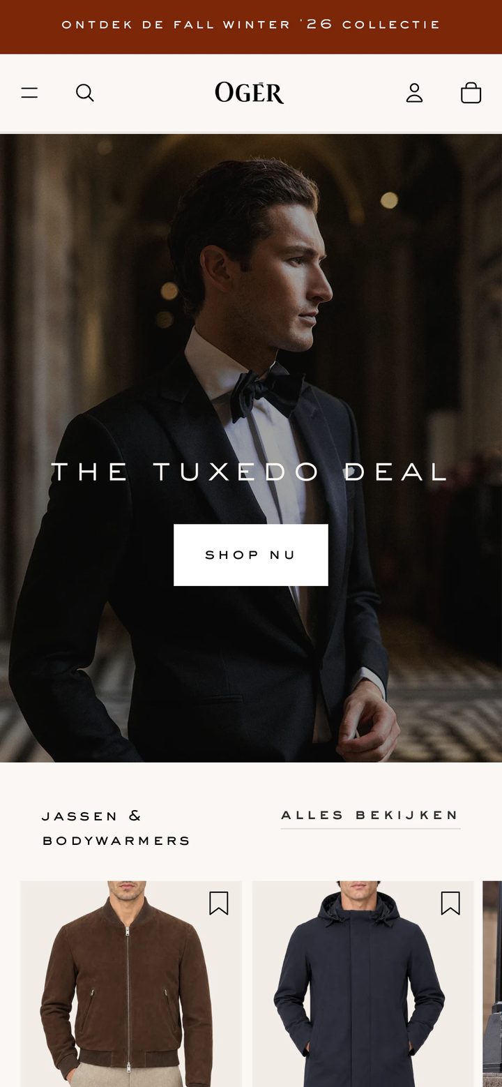
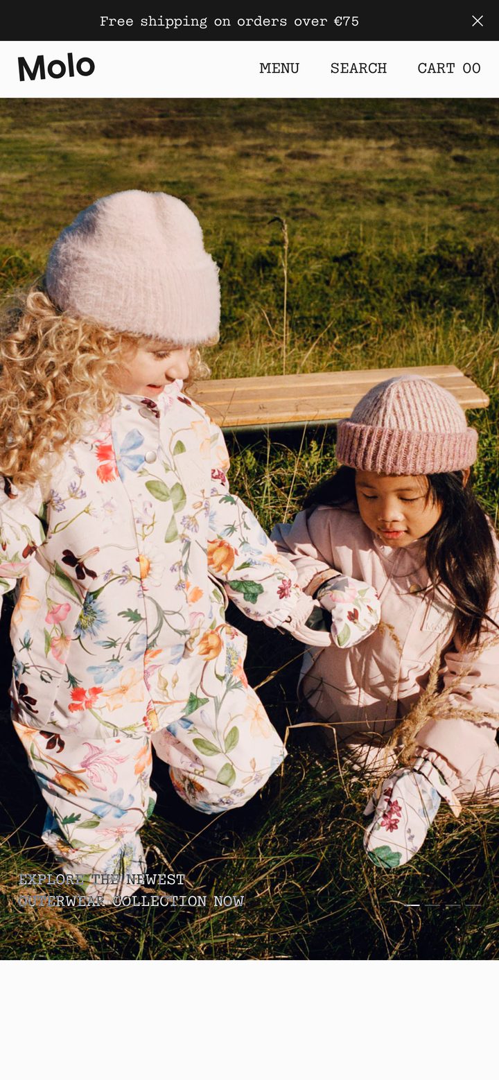
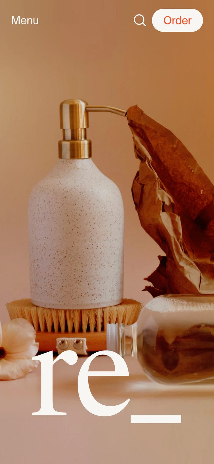
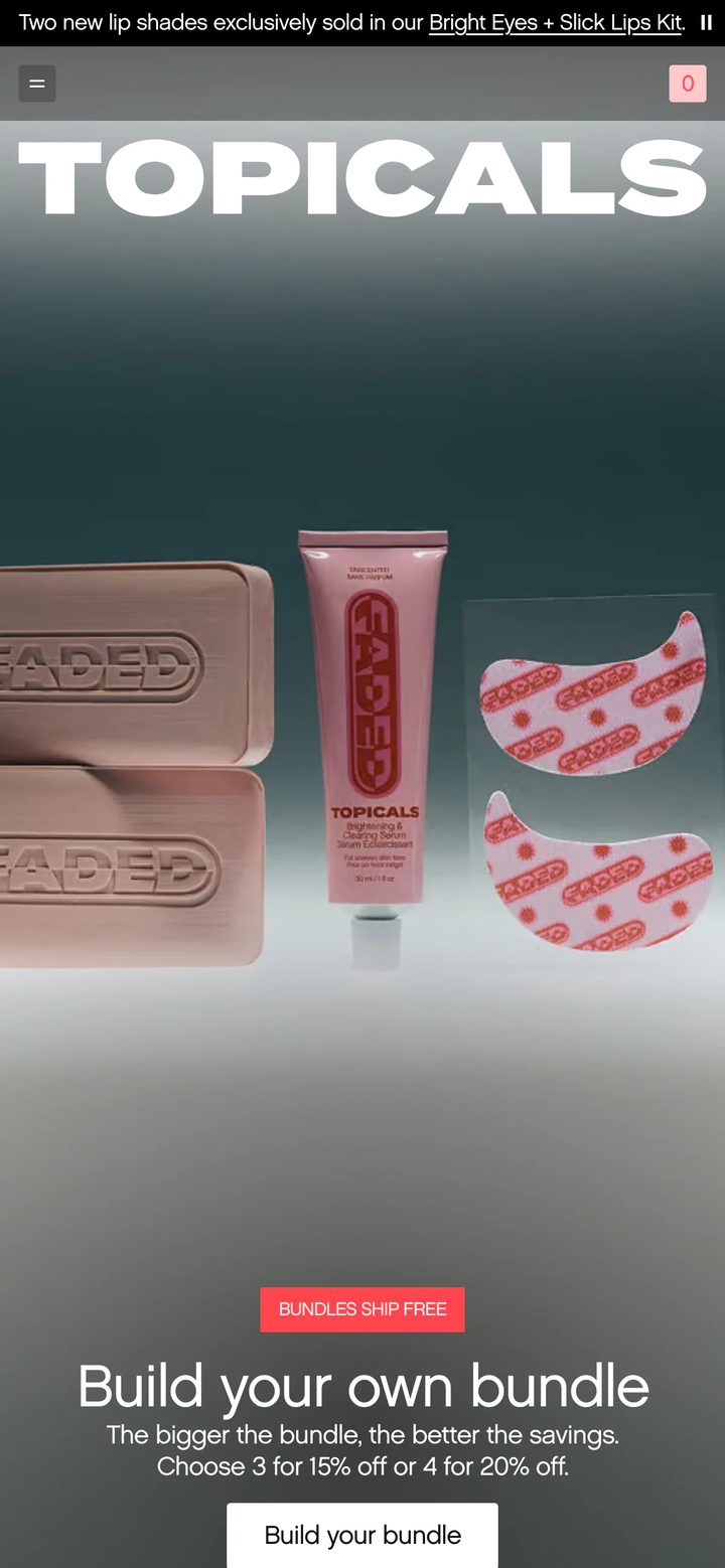
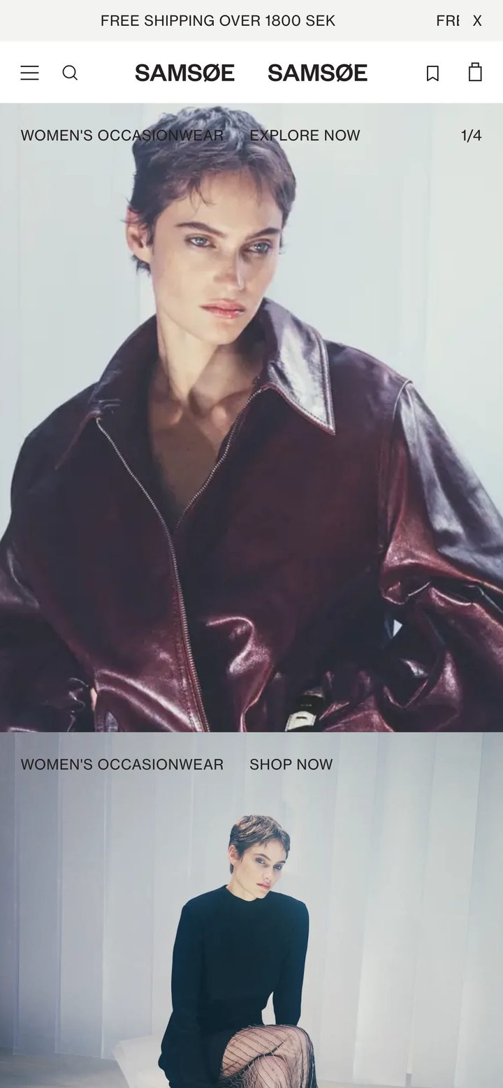
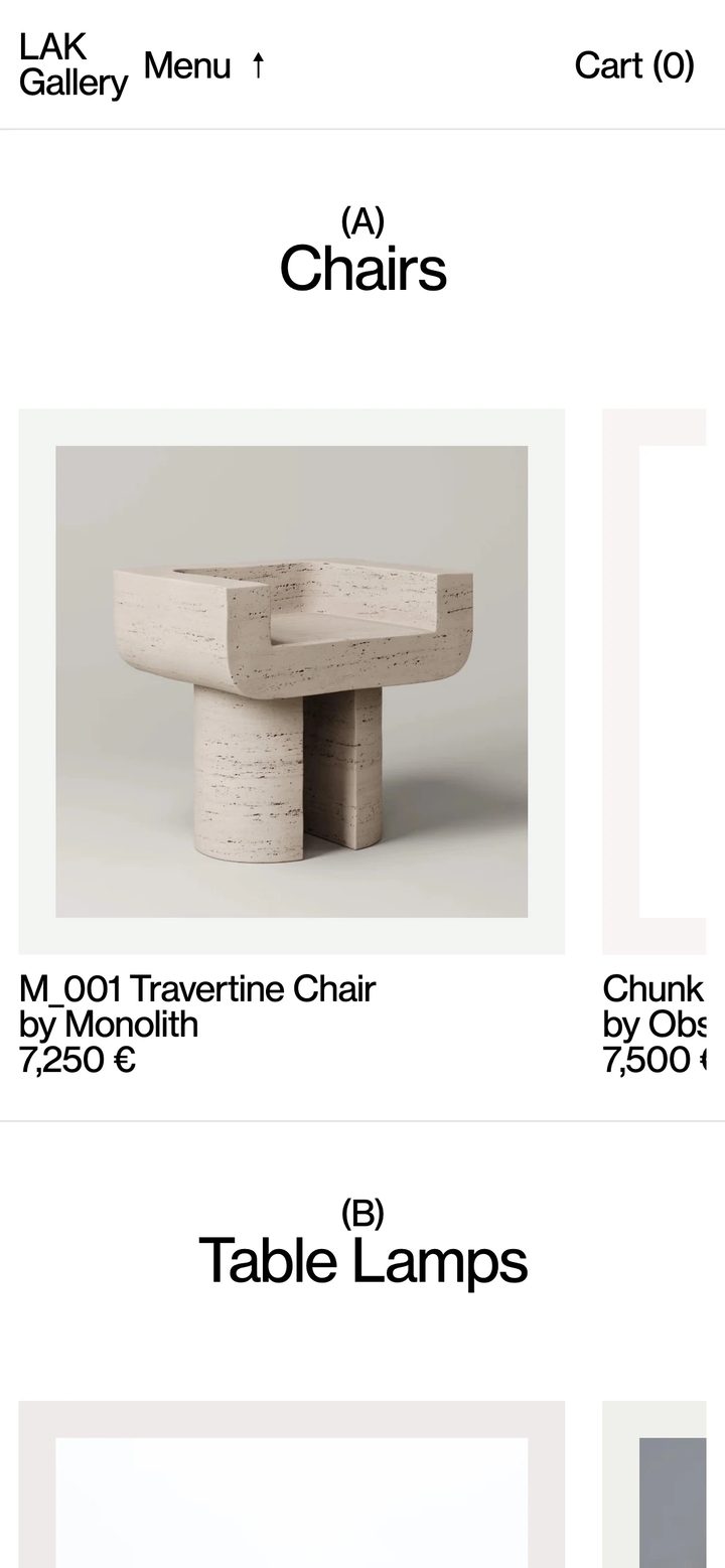
Mobile homepages from our selected stores. Most shopping happens on a phone, so these show how each store fits its brand into a small screen.



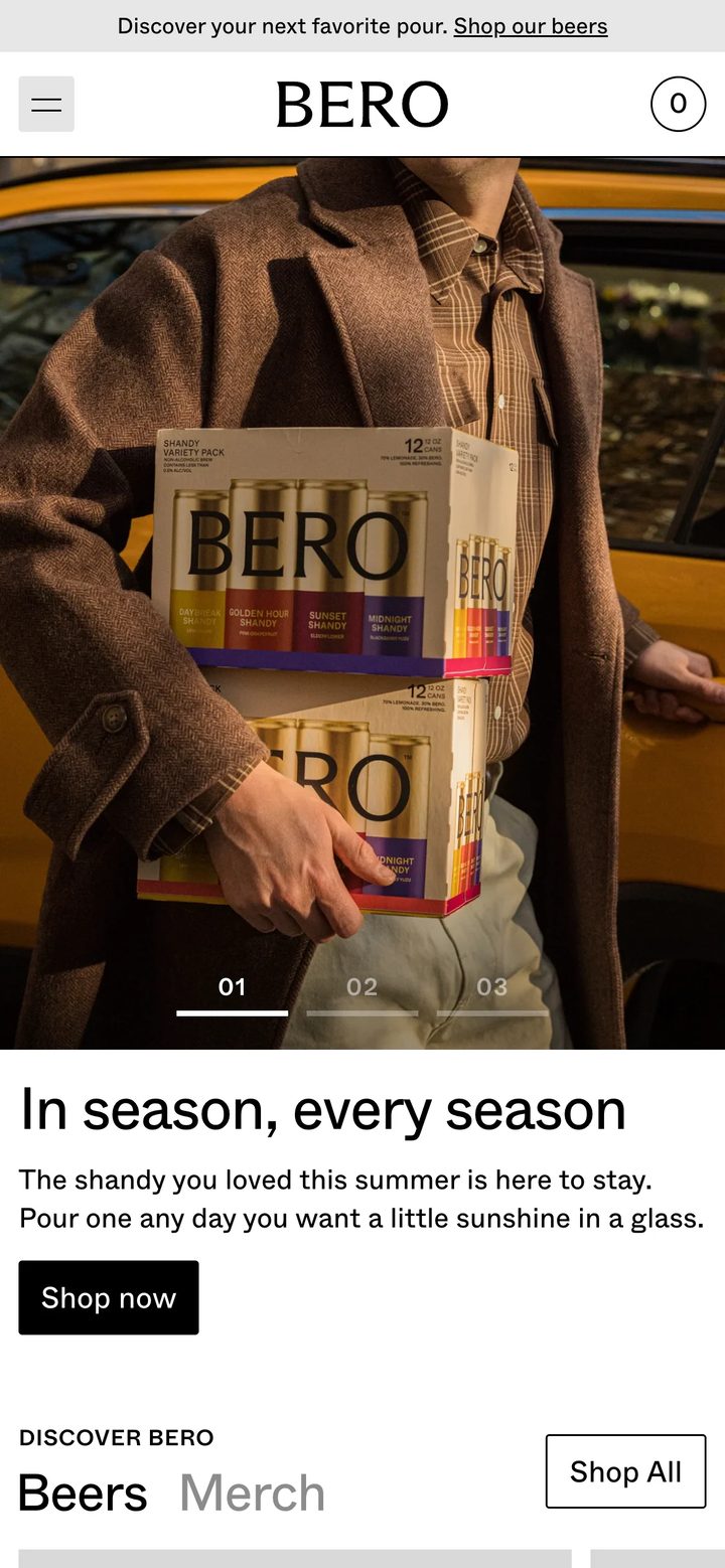
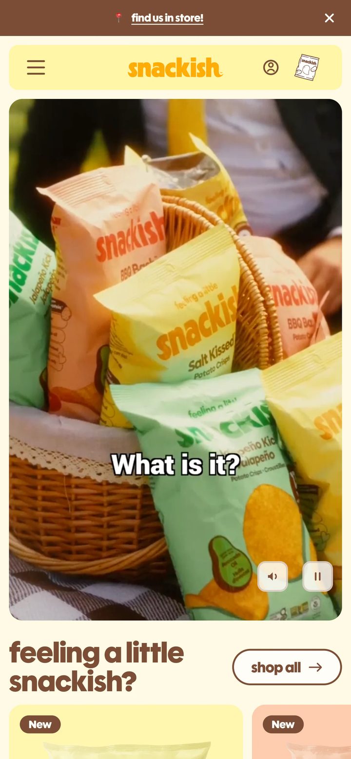
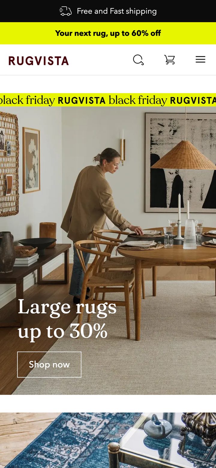
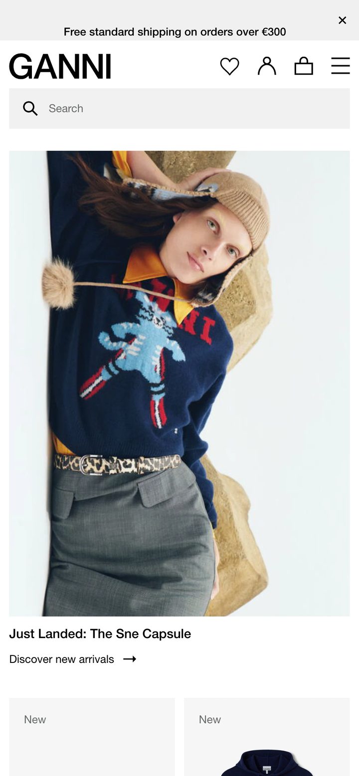








What to look for in mobile eCommerce design
A good mobile store isn't a squashed desktop one. A few choices make the biggest difference, and they're easy to spot once you're looking.
- The header. How much of the screen the logo, announcement bar and icons use up before any content shows.
- The menu. Full-screen, drawer or bottom bar, and how many taps it takes to reach a category.
- Thumb reach. Where search and the main buttons sit, and whether you could use them one-handed.
- Content order. What you meet as you scroll: products, a campaign or the brand story. It's often not the same order as on desktop.