161 selected stores
eCommerce homepage design examples
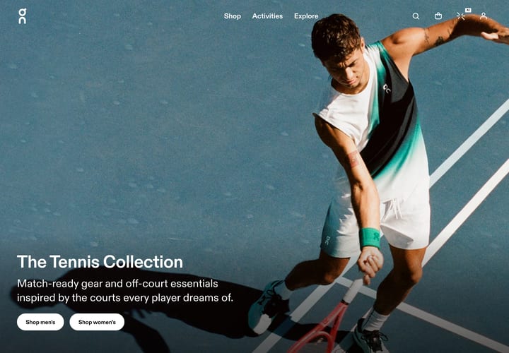
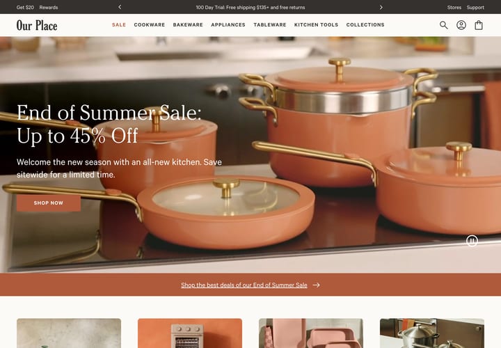
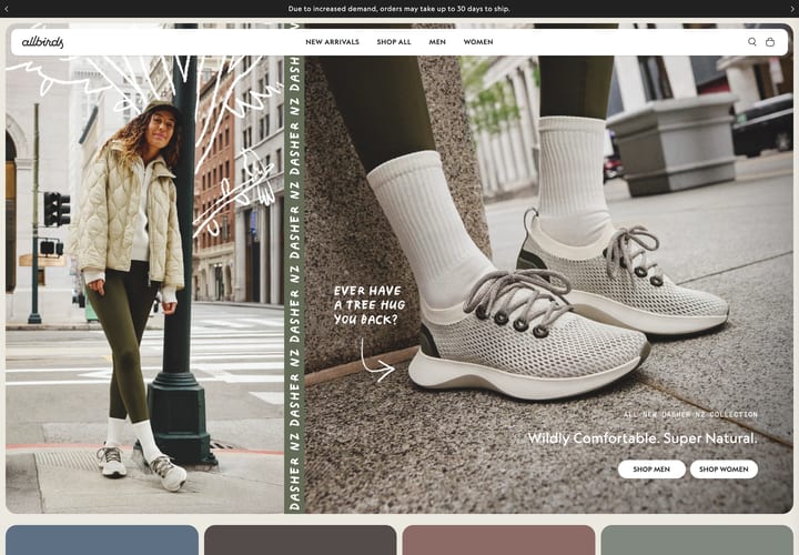
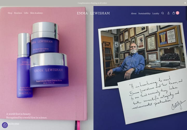
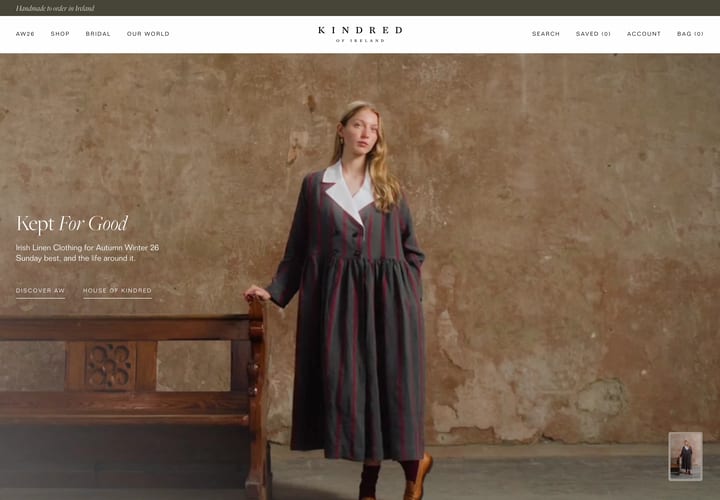
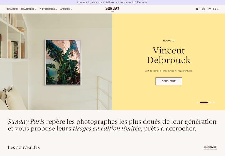
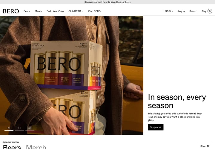
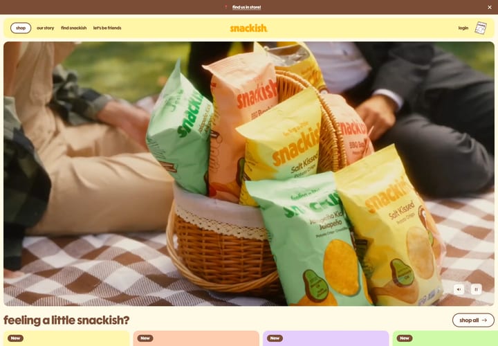
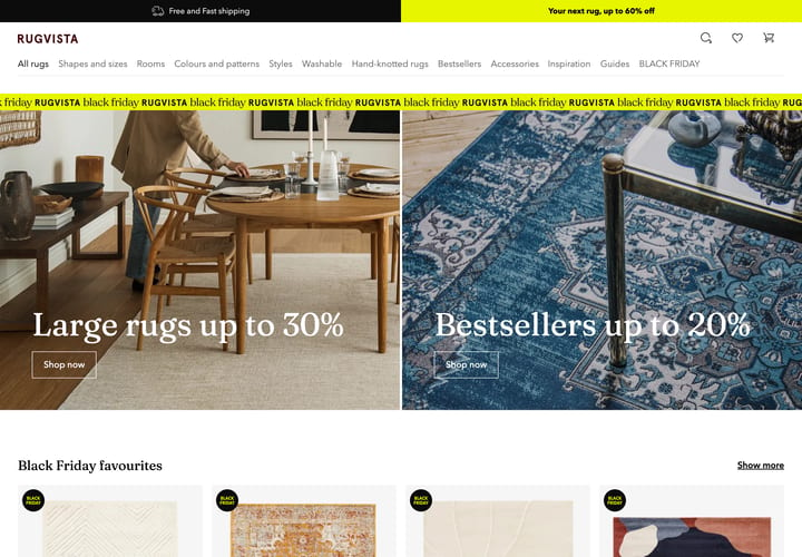
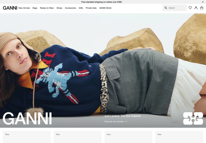
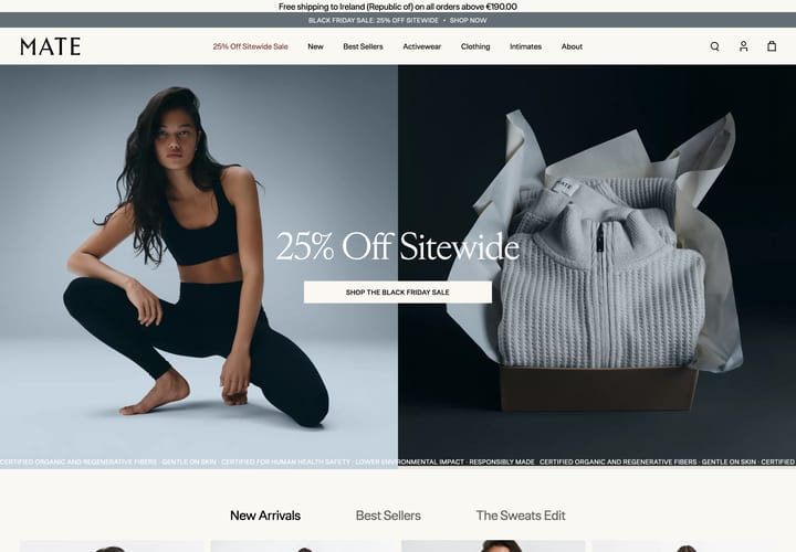
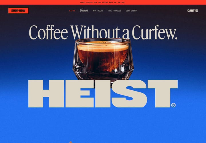
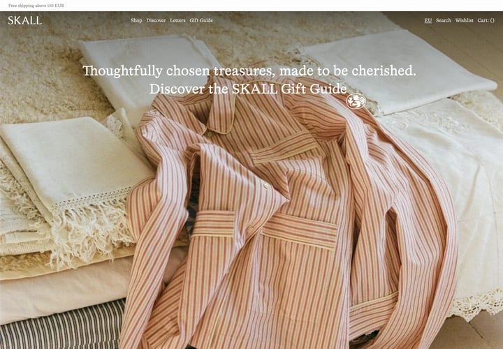
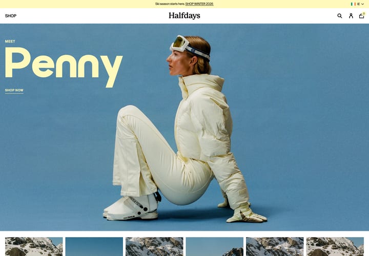
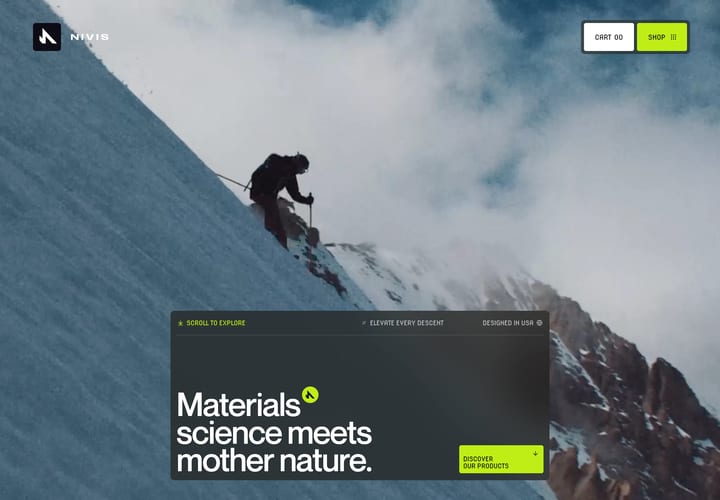
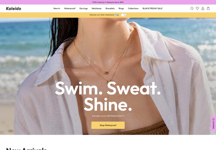
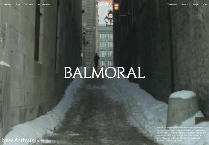
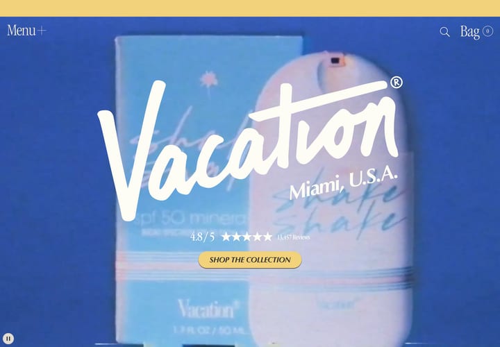
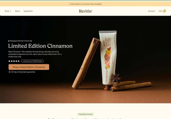
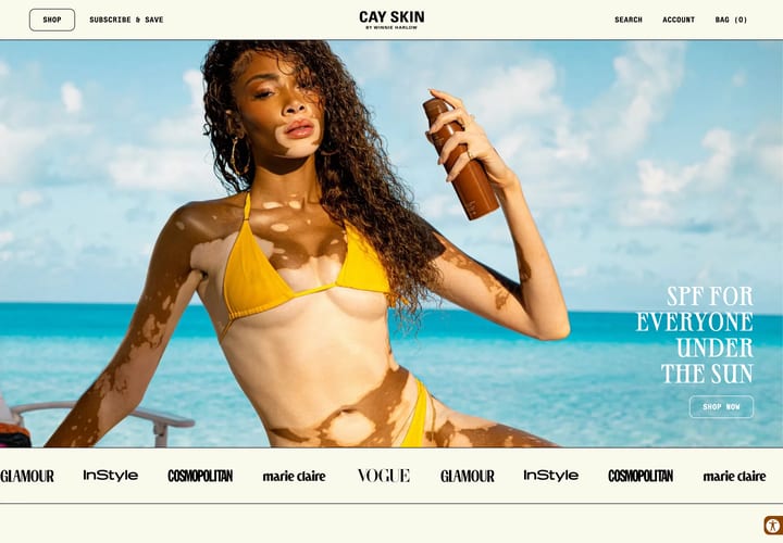
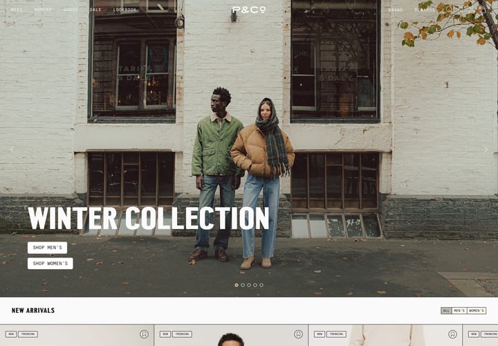
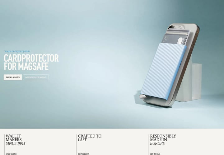
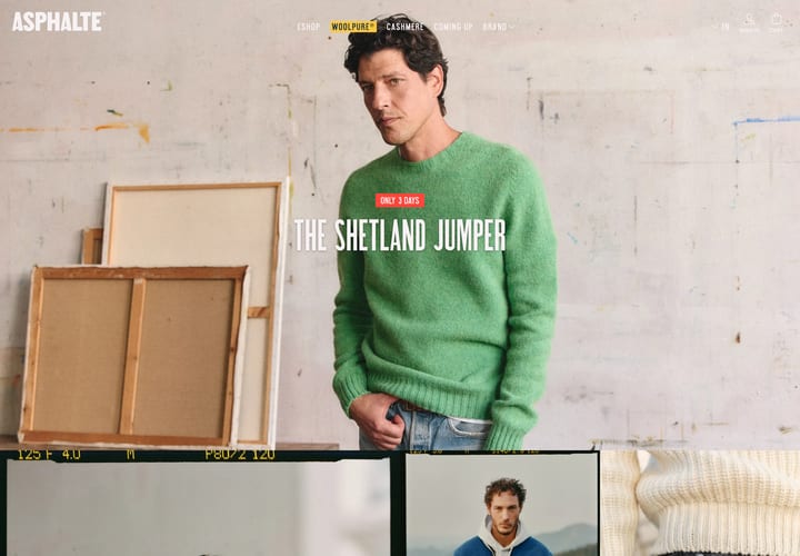
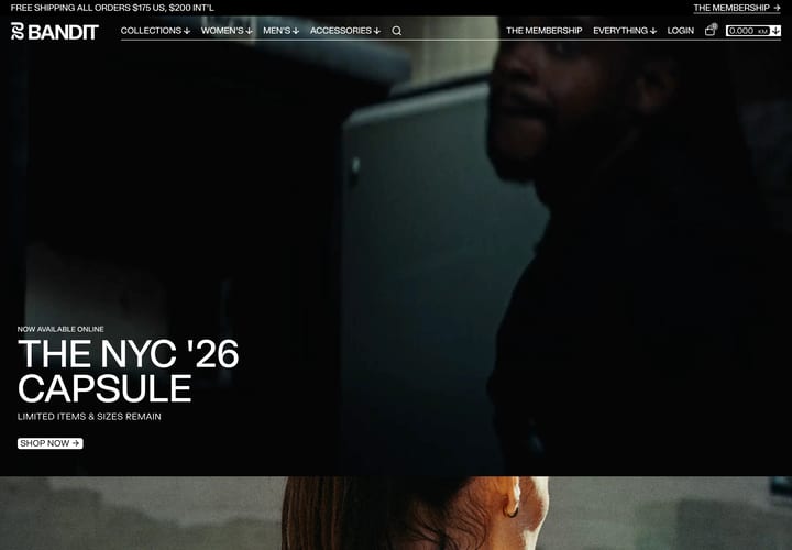
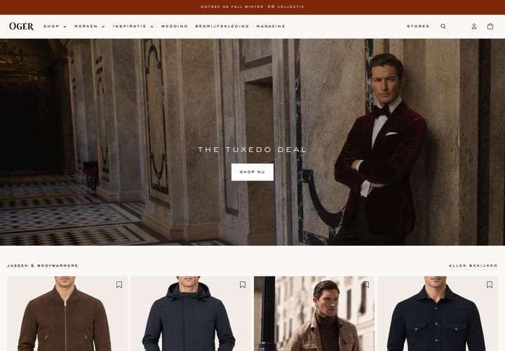
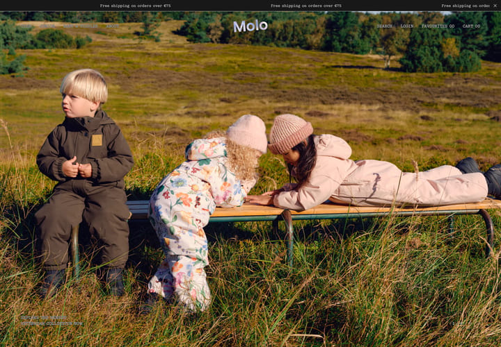
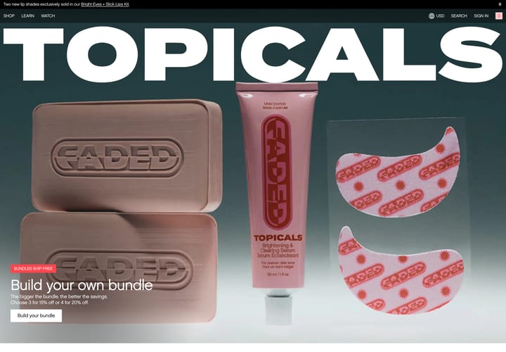
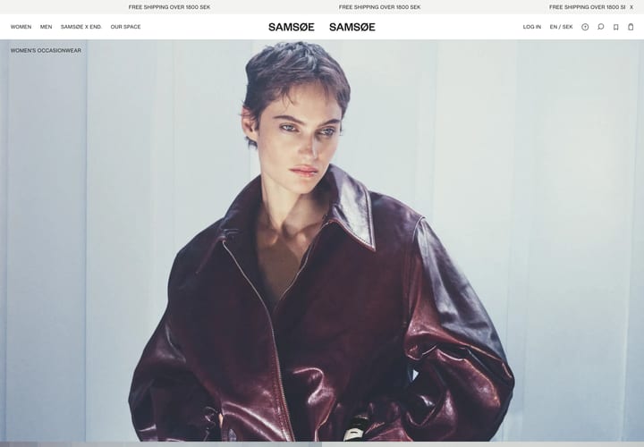
Homepages from stores we have picked for art direction and clarity. Look at what each one puts above the fold and how quickly it gets you into the products.


What to look for in an eCommerce homepage
A homepage gets a few seconds to say what the store sells. As you scroll through these, notice how quickly each one manages it.
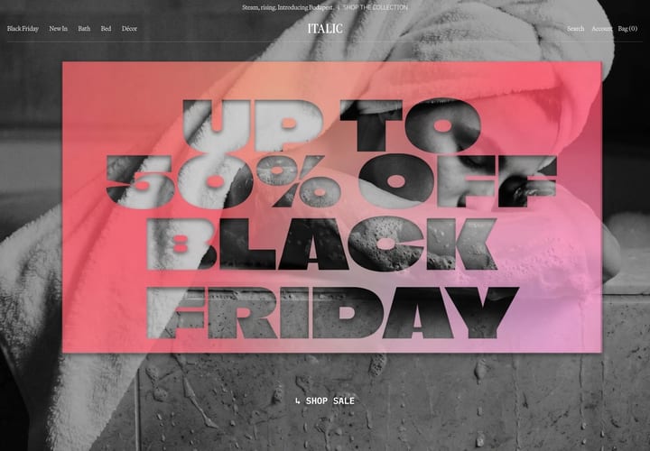
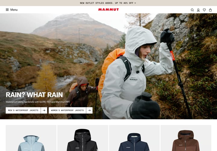
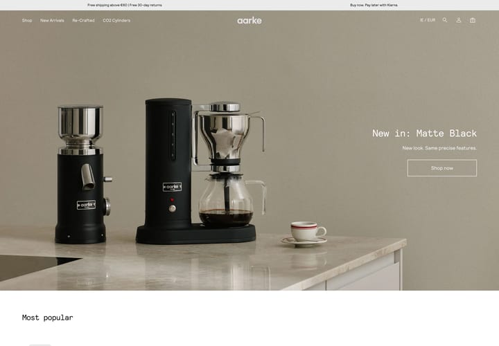
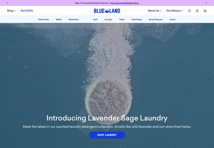
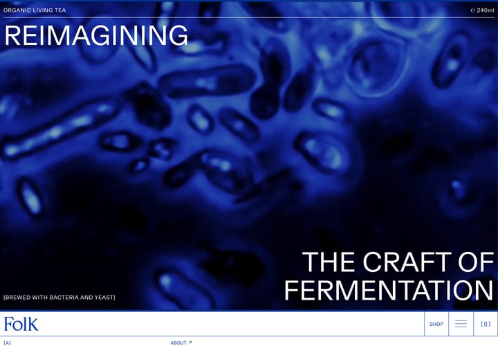
- The first screen. Can you tell what they sell without scrolling? Some lead with a product, some with a campaign, and a few with a mood image that leaves you guessing.
- Navigation. Count the top-level items. The tidiest menus use plain category names, and you can find search, account and cart without hunting.
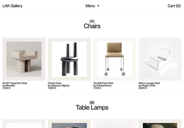
- Ways into the catalogue. Category tiles, a featured collection, a bestseller row. Most stores lead with one, and it says a lot about what they want you to do next.
- Reassurance. Delivery, returns, reviews, press. Look at how much room each store gives them, and whether they get in the way.